example gallery
The examples on this page are a subset of what is possible with seniority_list. The charts below were created using the built-in plotting functions included with the program. The plotting functions generally accept many different inputs and optional parameters, offering analysis over a range of attributes for single or mutliple employee groups. Again, much more is possible than what is seen in the samples below.
The datasets generated by the main program serve as the data source for the charts. Program inputs may be altered and new datasets quickly recalculated to reflect a different scenario, such as a change in job counts or a different recall schedule. All of the charts charts below could be redrawn to reflect those changes in a matter of minutes.
The visualization of the data is not limited to the built-in functions. Users with some coding experience may write customized functions to explore the data in other ways.
These charts are representative of a three-party integration. The program is able to handle an integration of any number of workgroups.
Note: Chart titles and other references in this gallery are generic. Actual charts include text linked to inputs. Job category descriptions in this gallery reflect airline pilot positions. The descriptions are easily customizable to match job descriptions for other industry case studies.
screenshots and notes
Most of the following plots have multiple inputs. These inputs allow various groupings to be studied. The more common groupings include values in a particular month or months, age or date ranges, employee group (eg) selection(s), quantiles, and job levels.
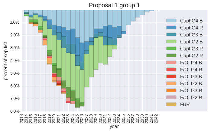
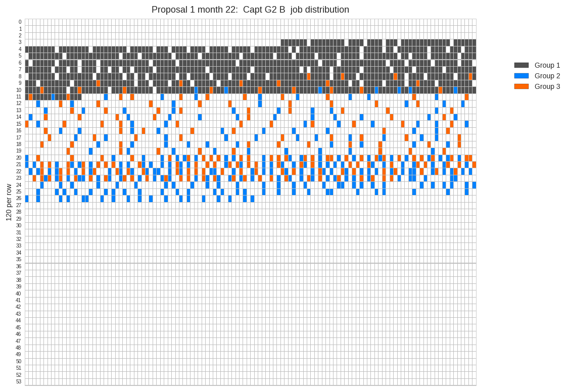
How are jobs distributed throughout the separate lists? This chart compares native job distribution to native list percentage. The shaded areas indicate that the job level distribution within one group is not monotonic (uniformly decreasing) due to a pre-existing special premium job assignment condition for certain members of one group and also furloughed employees mixed in with active employees.
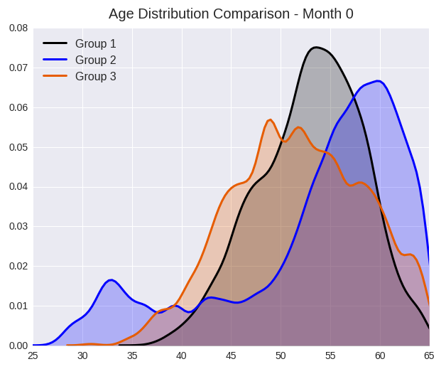
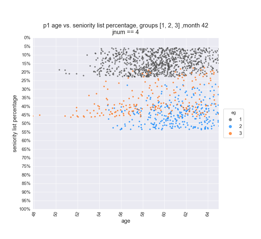
An age-percent chart presents a visualization of the distribution of employees by age and percentage within a proposed integrated list or standalone list(s). Users may plot data from a particular month, employee group(s), job level, age range, longevity range, etc.
Example view of a data for a selected single group displayed for a future month:
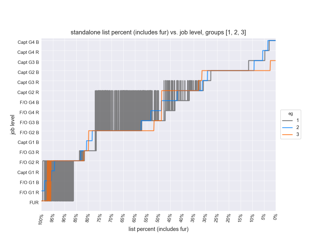
Due to jobs held at implementation combined with the no bump, no flush provision, employees actually holding a job within a job level may be dispersed over a wide range of an integrated list rather than falling within a concise percentile range. Other special conditions may have a similar effect. An example of this distorted disbursement is illustrated below. The three groups are holding the same job within the integrated list yet are located on the list at different levels. After implementation and as the separate groups mesh, this stratification would lead to different job opportunities within the same bid category.
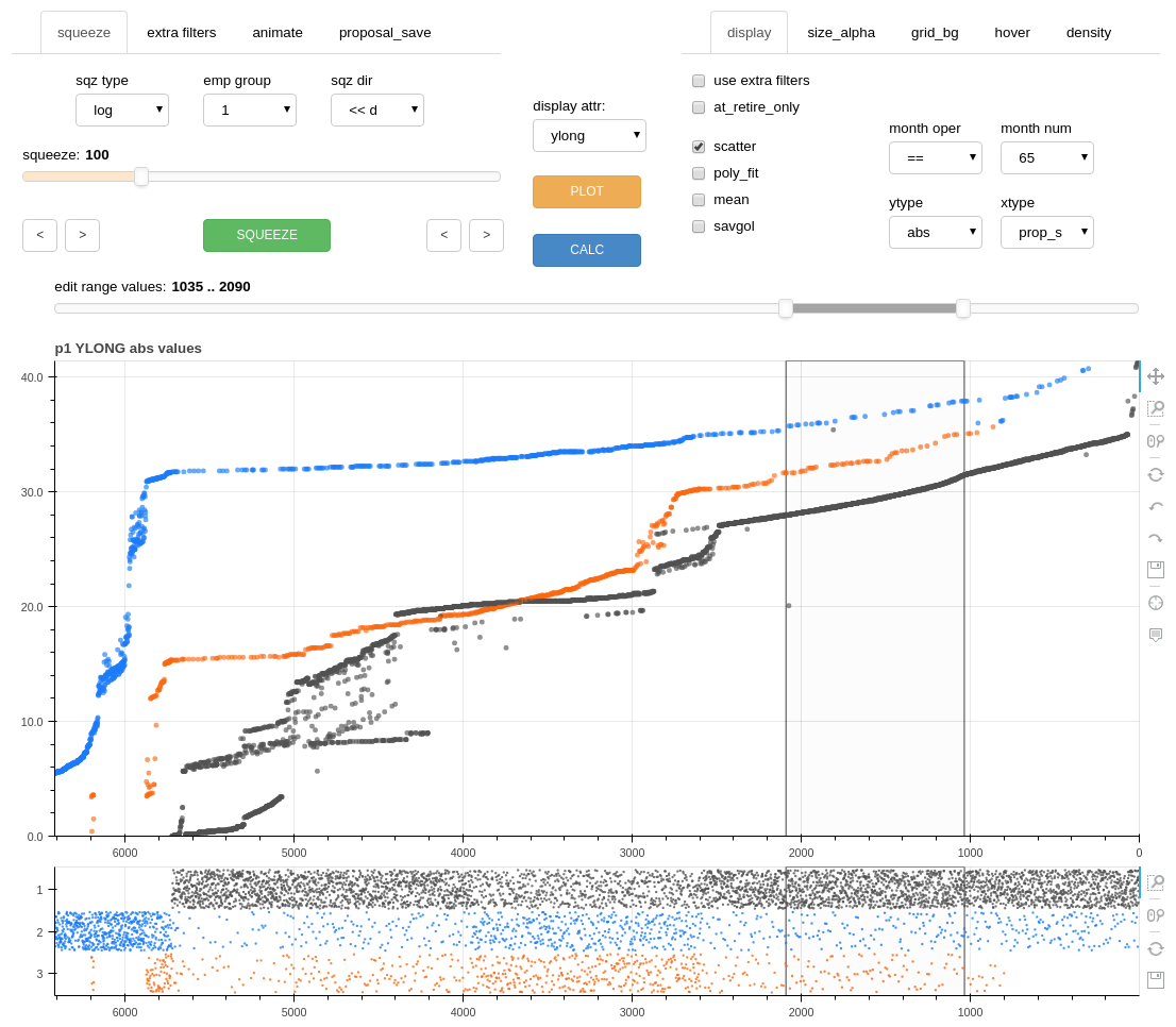
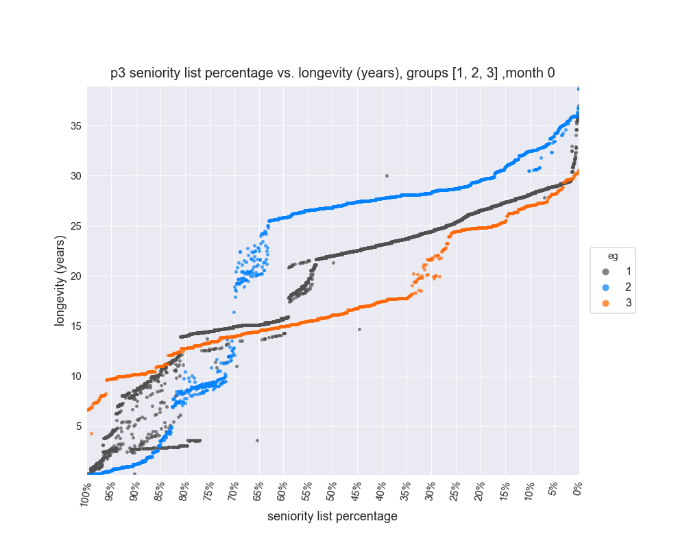
Here is an example of an aggregate group measure in the form of average longevity vs. list percentage for three groups. YLONG stands for the decimal year longevity attribute. The y axis is years of longevity and the x axis is list percentile.
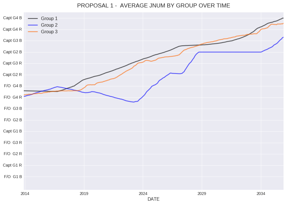
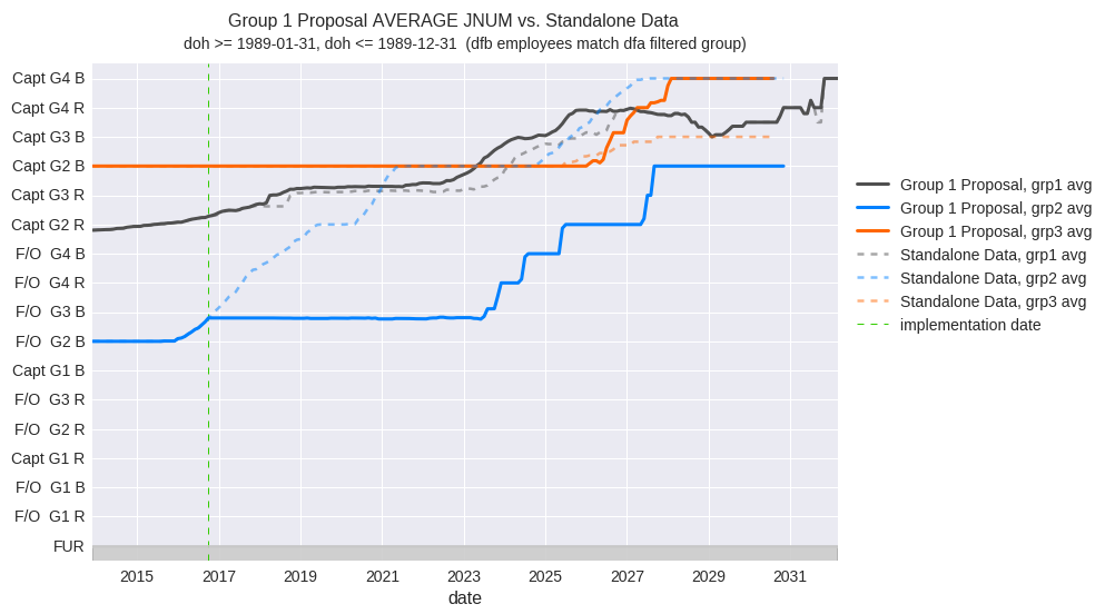
The following chart illustrates the average JNUM (job number) indicated with respective job description labels (y axis) for a proposed list over time. The job description labels are fully customizable inputs.
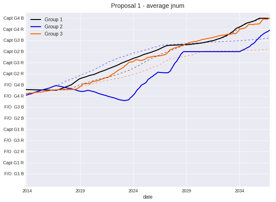
This is the same chart with comparative standalone average job levels added with the dashed lines.
Specific employee numbers may be selected for individual plots. The plots reflect an average for that percentage level on the list for the respective employee group due to the fact that the list is organized in a stovepipe fashion.
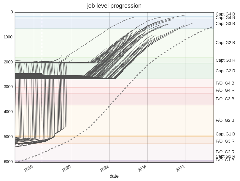
In the following chart, the display indicates the job level progression for three employees from three different groups. These employees are next to each other on the proposed list. The three employees initially hold three different jobs from their original lists. The employees which initially hold a higher level job are protected in that job until his or her new list cohorts “catch up” through the job vacancy process. At that point, all three track together until retirement.
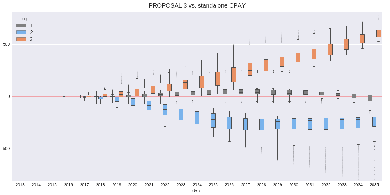
Because a compensation attribute is built into the model, it is possible to study the change in the flow of money among the workgroups. In the chart below, a normalized compensation comparison is made with standalone figures. The model assumes the same level of compensation pre- and post- integration. This result could also be thought of as a job quality change measurement.
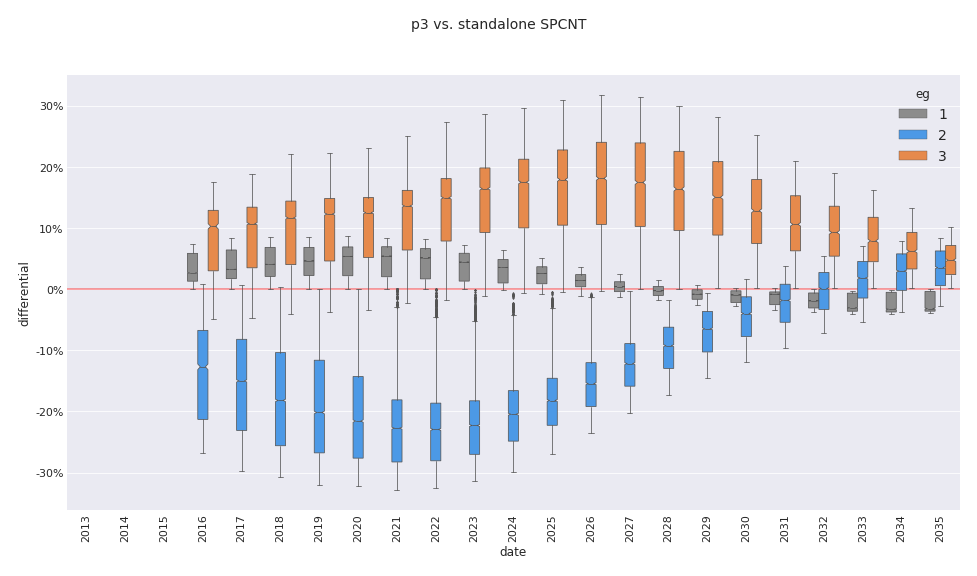
Several attributes may be loaded into the function which produced the chart above. Here is another example of the same charting function which compares list seniority percentage, native vs. proposed ordering.
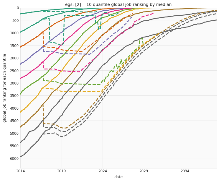
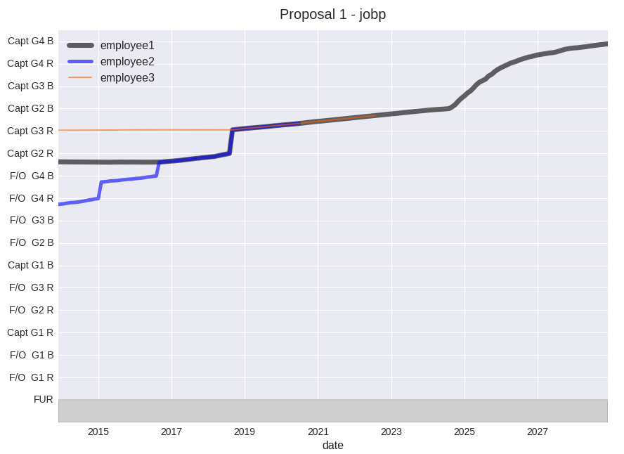
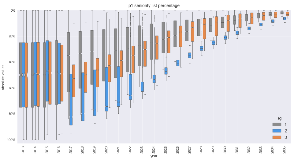
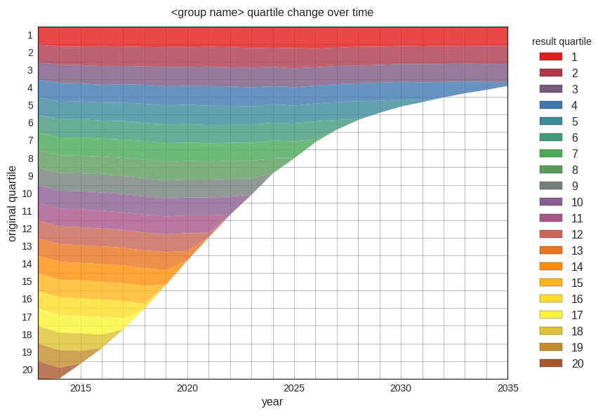
Actual attribute value ranges (as opposed to differential values) for each employee group may be plotted as well. This chart compares the placement of employee groups within an integrated data model for each year through 2035 (x axis) in terms of list percentage (y axis, most senior at the top), with implementation of the integrated list in late 2016. Other dataset attributes may be easily displayed, such as job category ranking or career pay.
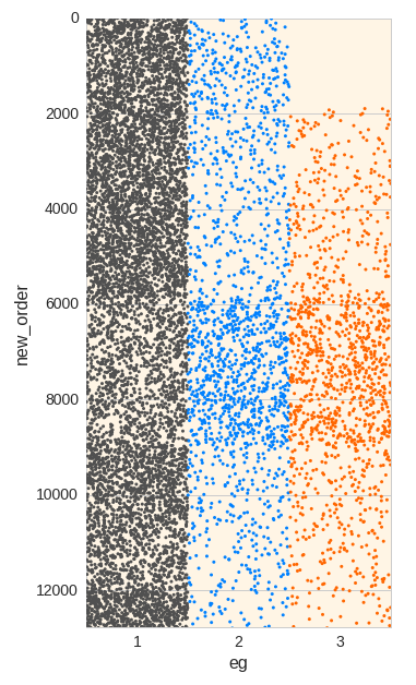
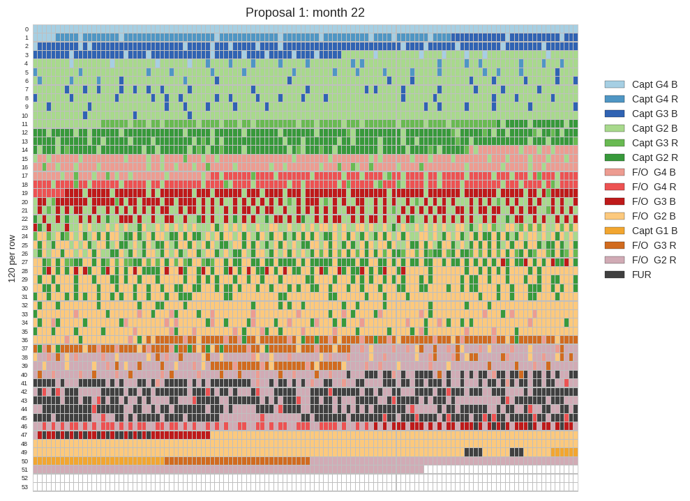
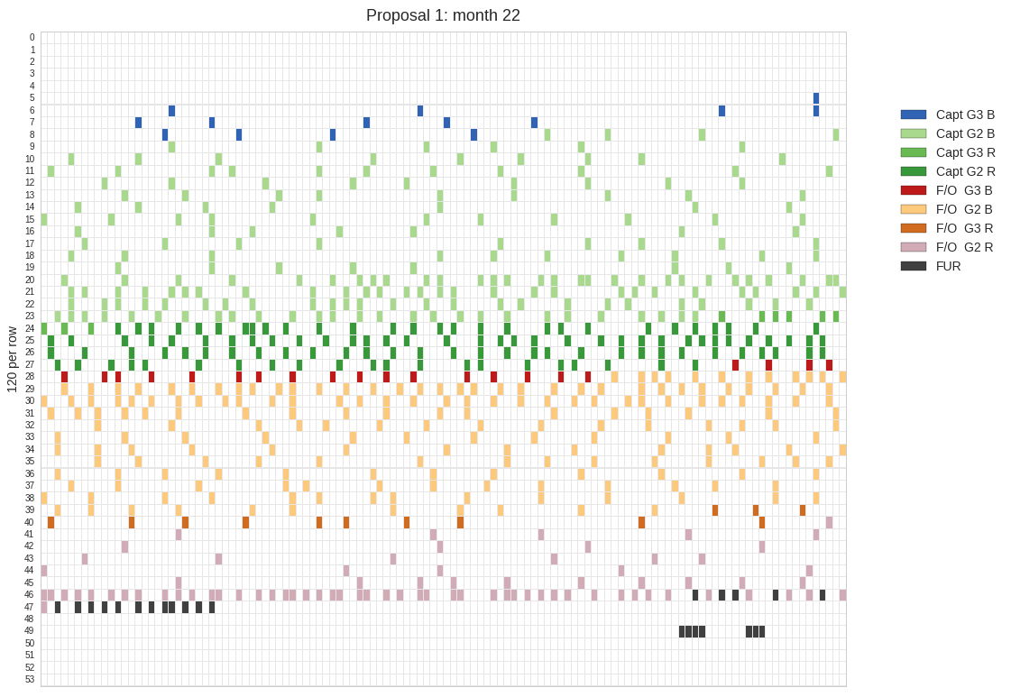
The vertical stripplot offers another way to visualize employee group distribution.
Here is a stripplot which reveals the job distribution within correctly sized job level bands, for a month in the future, for a particular proposal.
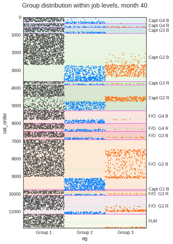
This chart shows the distribution of the employee groups within each job level as it relates to a proposed seniority ordering. The green markers represent a subgroup of one of the main groups. This subgroup has special job rights which existed prior to the integration. The program incorporates and accurately models special conditions.
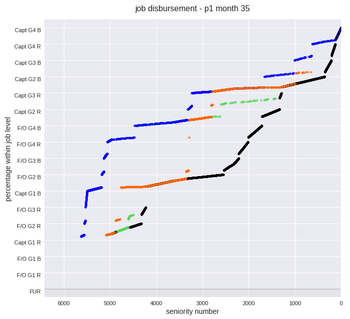
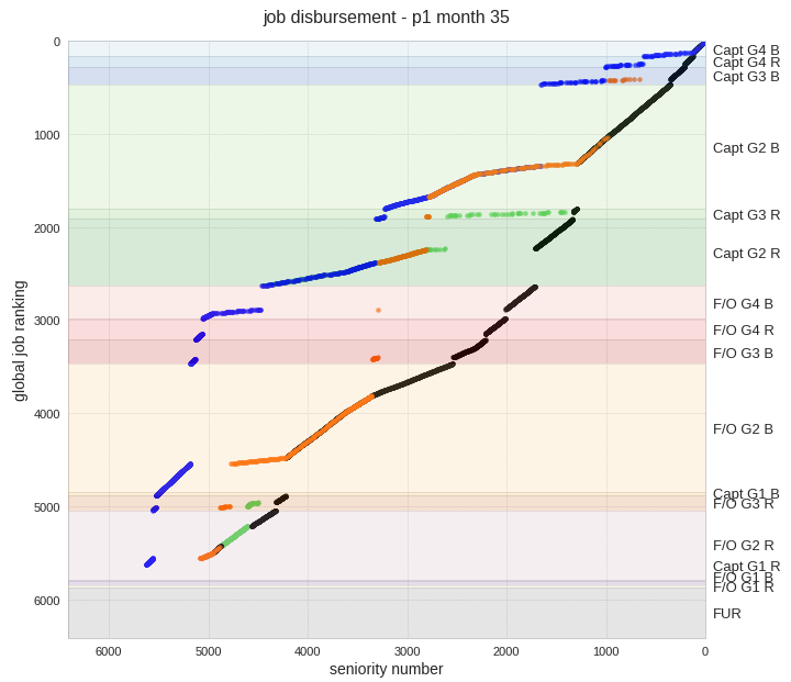
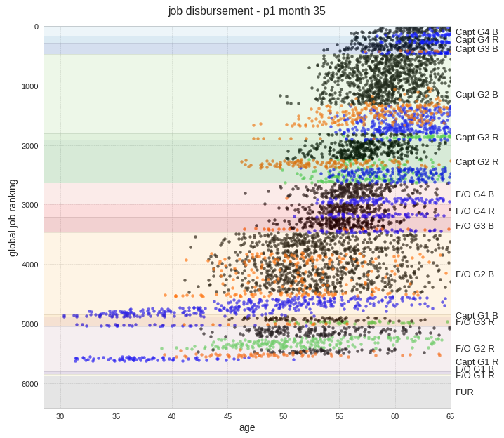
This is a scatter plot displaying similar information as the chart above, with the added feature of appropriately colored and correctly scaled job level bands. The 35th month of the model has been selected for study, which in this case is the first month following the implementation of the integrated list. The displayed job bands account for job count changes over the life of the data model and are correctly sized for the selected month. Each employee group may be displayed separately and a line chart may be drawn instead of the scatter plot. There are other chart options as well. In this particular presentation, the green markers again identify a subset of one of the employee groups who possess special job assignment rights.
Similar to the above chart, with the x axis changed to reflect age:
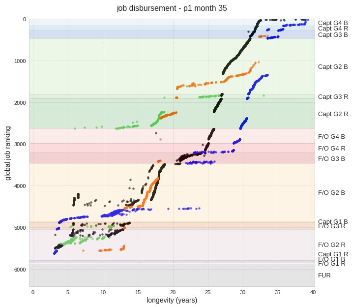
…with the x axis changed to reflect years of longevity (in this case, stovepiped, or ordered, longevity for each group):
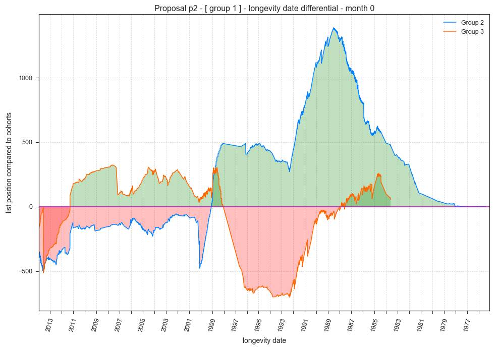
Differences between list locations for employees with equivalent attribute values but from different groups may be studied with the cohort_differential chart. In the following example, the longevity attribute for employee group 1 is being compared to employees from groups 2 and 3. The code finds the list locations of employees from groups 2 and 3 which match the longevity values from group 1, then displays the location differences from the group 1 locations.
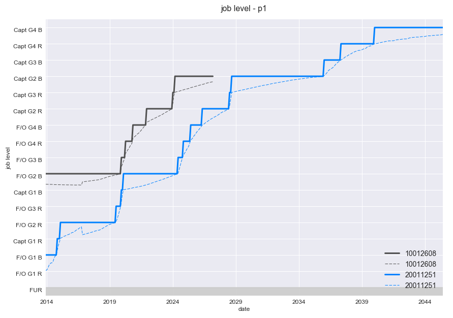
Job levels obtained over time may be visually represented by a step-type chart and/or by a line representing the percentile within that job level.
The datasets may be filtered and sliced in many ways to examine and compare target ranges. This is an example of time slicing, focusing on employees hired in 1989. Note that the underlying data model incorporated a delayed implementation date of late 2016. The employee groups operate independently until then.
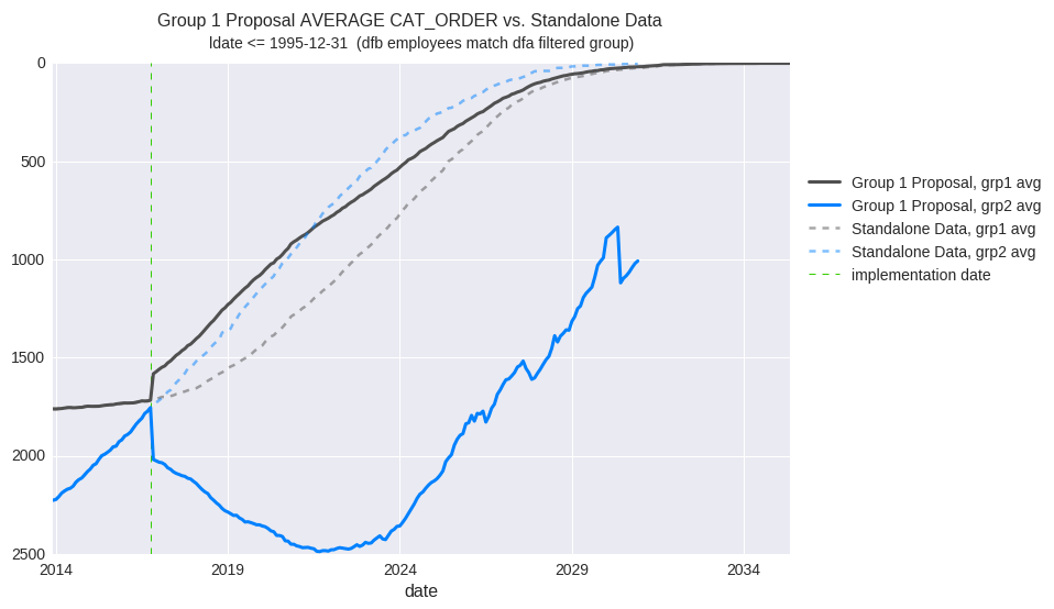
In this example proposal, a significant loss is indicated for one group while another group gains. Standalone data is indicated with the dashed lines. Note that the groups began with nearly identical values at the implementation date. This chart is displaying a slice of a job rank attribute reflecting employees with a longevity date of 1995 or earlier.
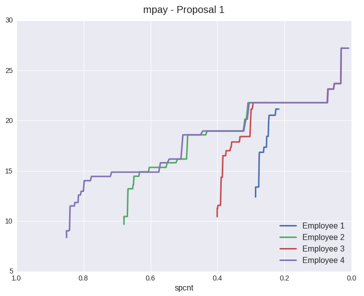
Here is a chart utilizing the compensation section of the data model. The y axis represents monthly compensation in thousands of dollars while the x axis indicates percentage on the list. In this case, the plots represent results for several individual employees.
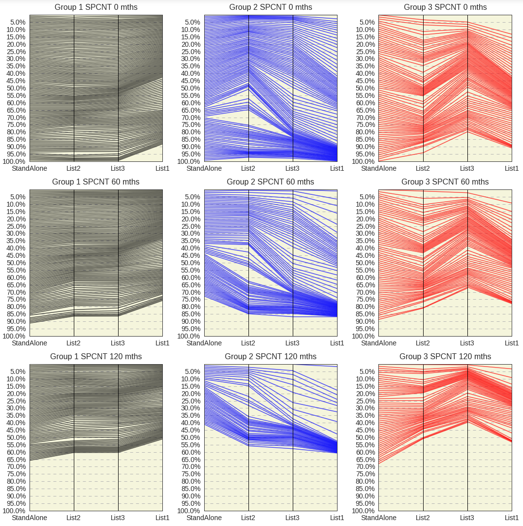
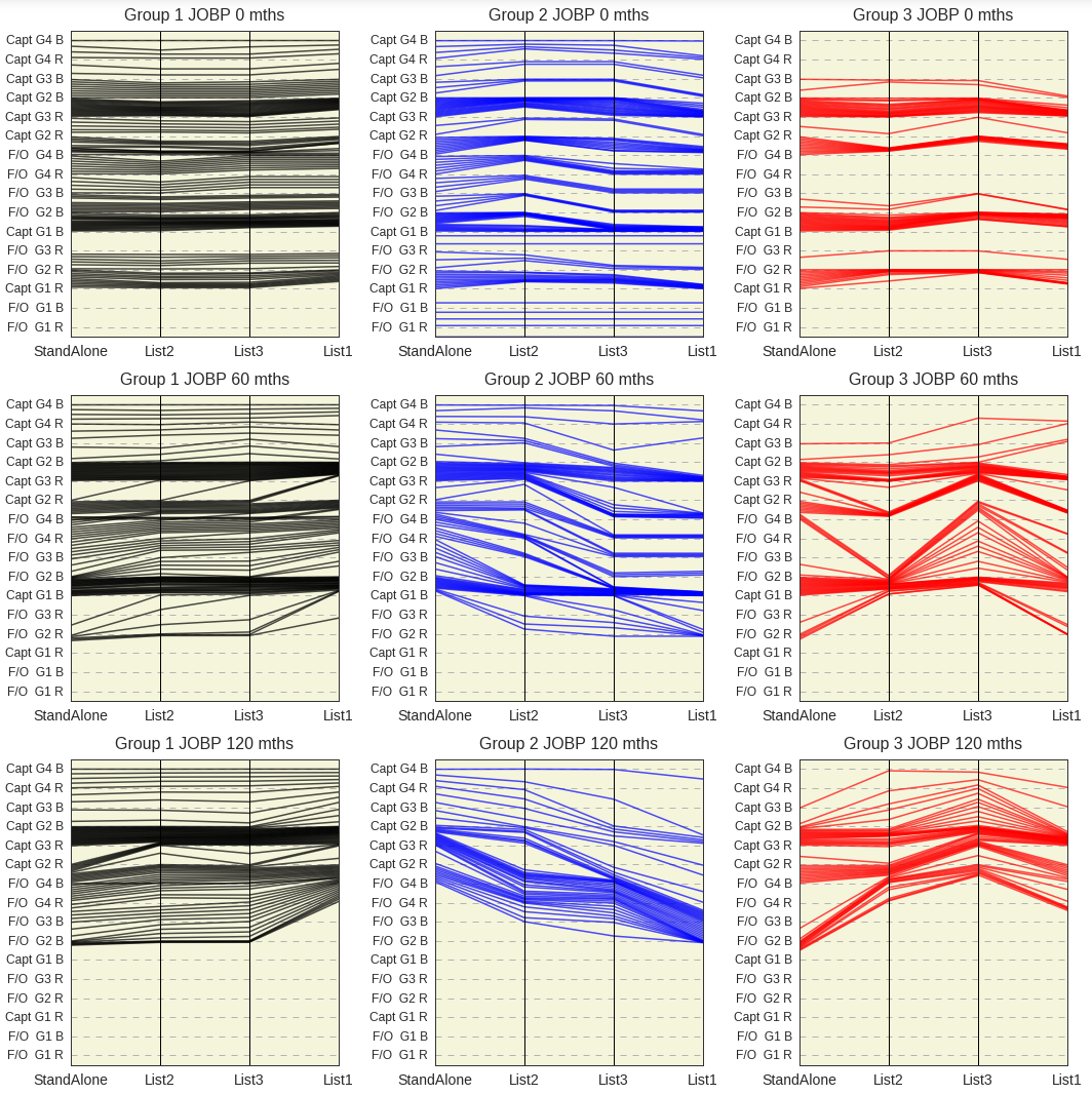
Parallel coordinates type charts are very good at comparing positional differences, such as when comparing list percentage or numerical job levels.
For each of the subplots below, standalone list percentage is indicated on the left vertical line. The top row is for month zero, and the second and third rows are for future months. The other vertical lines represent the list percentage for those same employees within different proposals. Any number of groups and future months may be plotted and the left vertical line can be set to represent any of the proposals.
Same as above, with percentage within job level attribute. (May not be the same proposal as used for chart above)
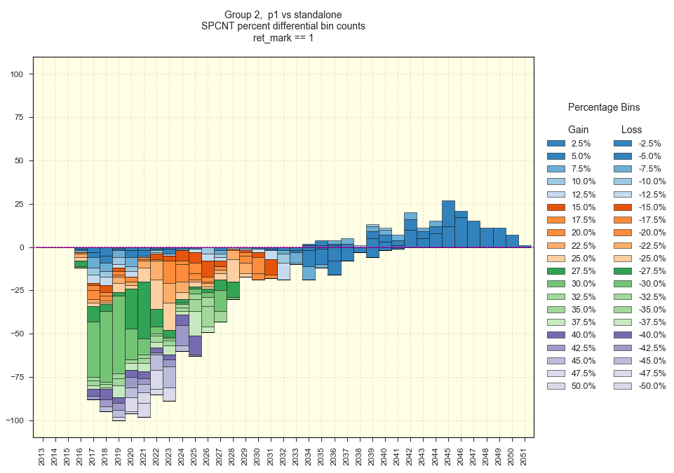
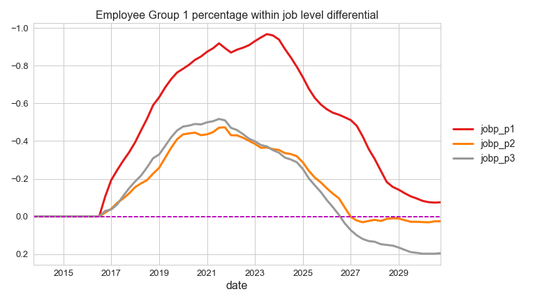
List percentage differential over time may be analyzed in another format utilizing differential binning, or counting the number of employees within various levels of percentage change. The following chart displays the annual differential between proposal “p1” and standalone data, as it applies to employee group 2.
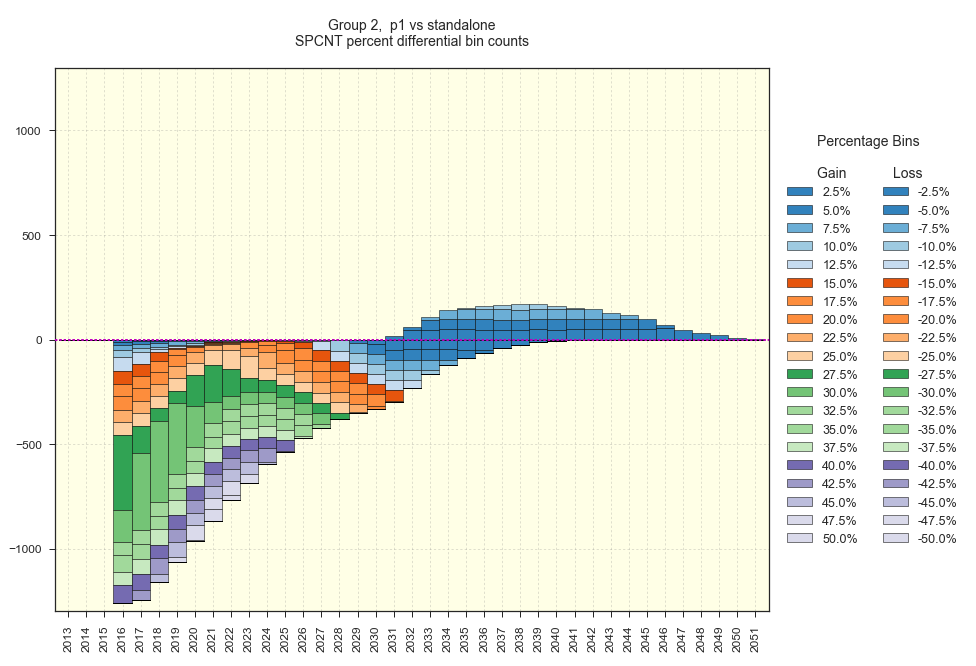
annual percentage differential bin counts, revealing loss in list percentage up to 50% for many years
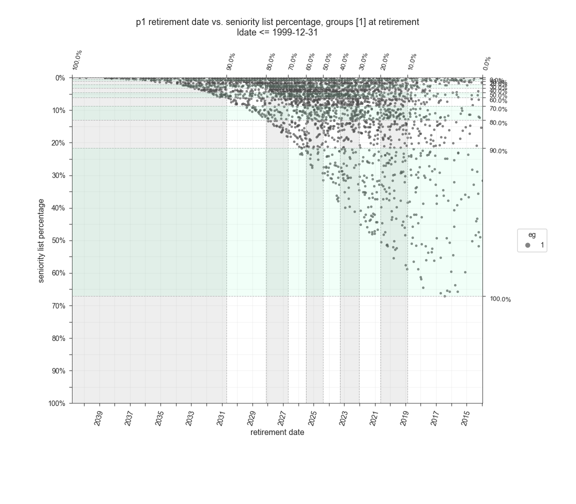
This type of chart, along with many of the other built-in charts, may easily be set to display data which has filtered by up to three attributes. The chart below is showing differential in list percentage at retirement for employees belonging to employee group 2.
This is one chart from a set of charts representing annual retirement data for the employee groups. The bars indicate percentage of original group count retiring each year and the job level held at retirement.
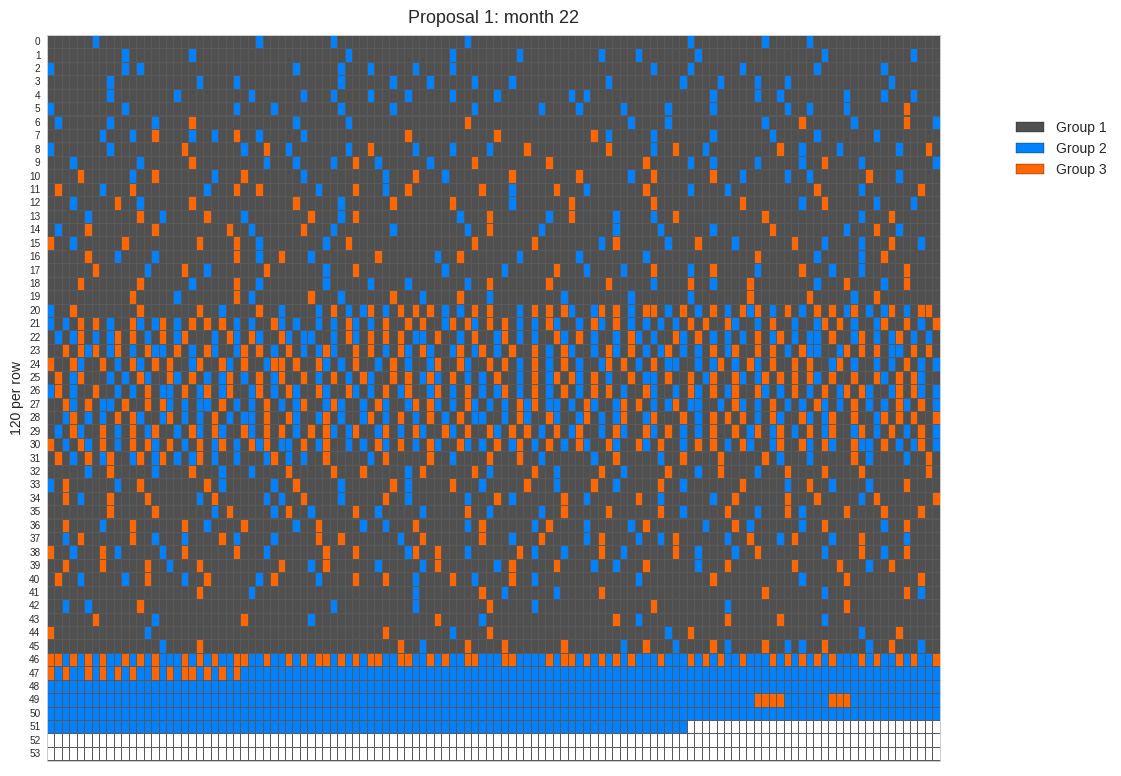
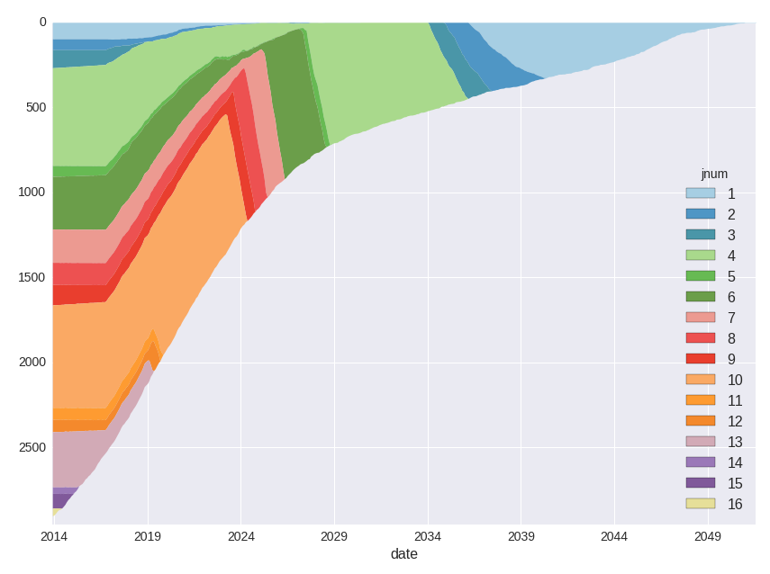
Rows of colors charts may also be produced. In the following chart, each color represents an employee group or furloughees. As with most of the other program charts, this type of chart may be quickly customized to present various data for any month.
How are jobs within a job level distributed? This is a rows of colors chart very similar to the age-percent chart above.
How are all the jobs distributed?
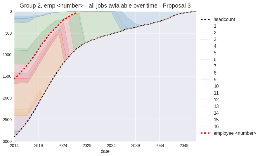
Finally, show only the jobs assigned to one employee group.
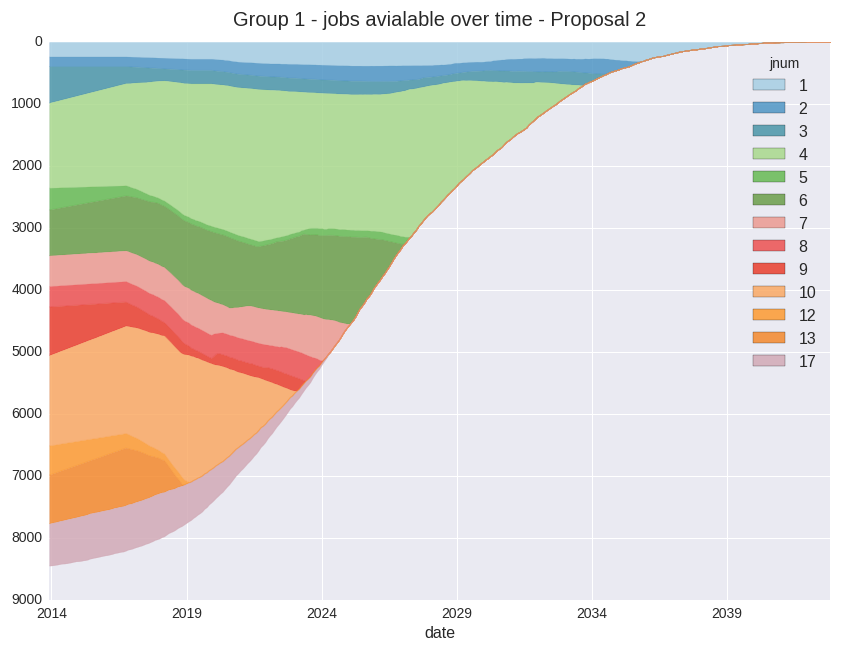
What is the actual count of jobs held within each job level by each employee group over time? In the charts below (an excerpt of the output), modeled job counts for a proposed integration are represented by dashed lines against a baseline (normally standalone) shown with the solid lines. The total count of jobs within a given job level is represented with the green lines. This chart type is closely related to the job transfer type chart described below.
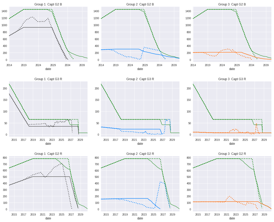
job counts for three job levels (horizontal alignment) for three employee groups (vertical alignment) - dashed lines are the outcome counts for an integration proposal
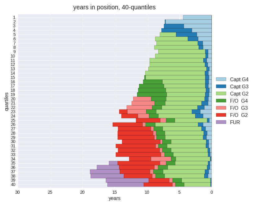
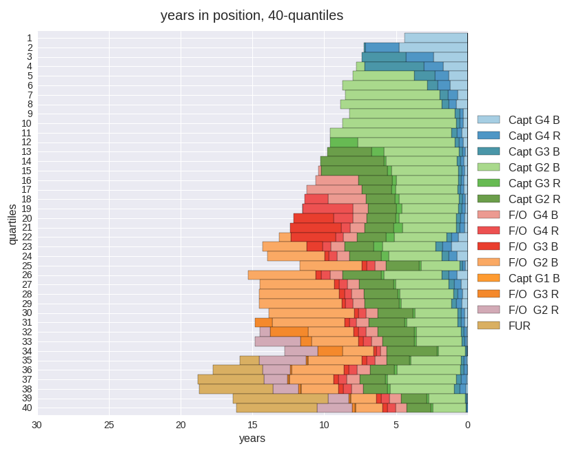
This chart displays the average years spent in the various job levels for an employee group within a proposal using the basic job level model. The results are grouped by quantiles. There are eight job levels within the model while using the basic job level mode in this example. The number of quantiles for the study may be changed easily.
Same as above, except using an enhanced job level model. The process to change between basic and enhanced job level mode is trivial. The enhanced job level mode will split the major job levels and allows more detailed job level ranking and ordering. The colors representing the job categories are fully customizable.
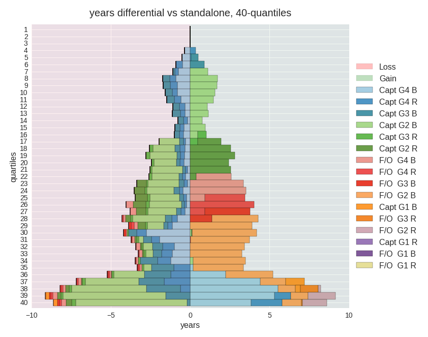
The differences between quantile years in position may be studied as well.
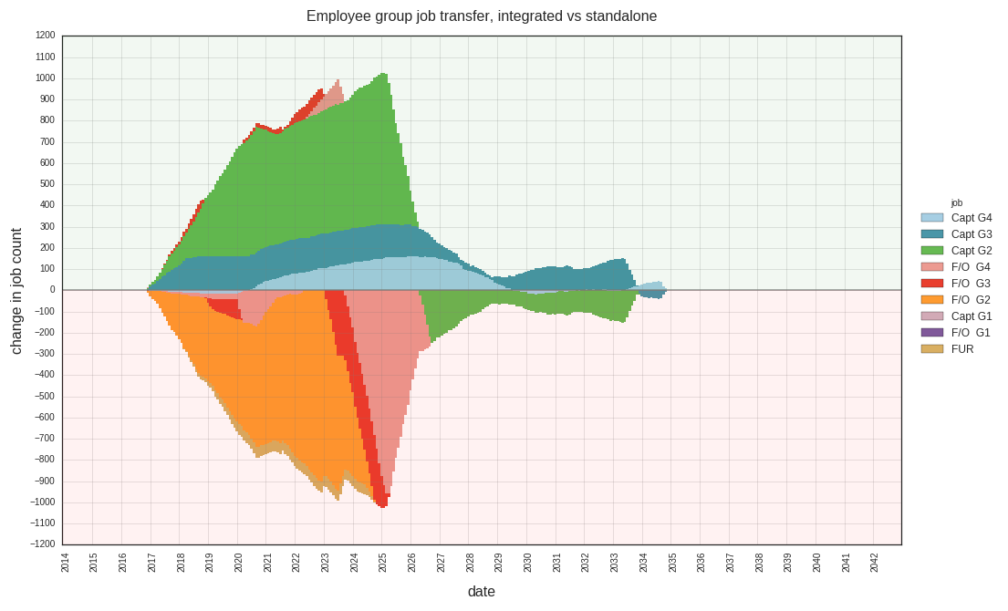
The jobs available to each group will change when operating within an integrated list. The job transfer charts reveal how they will change over time.
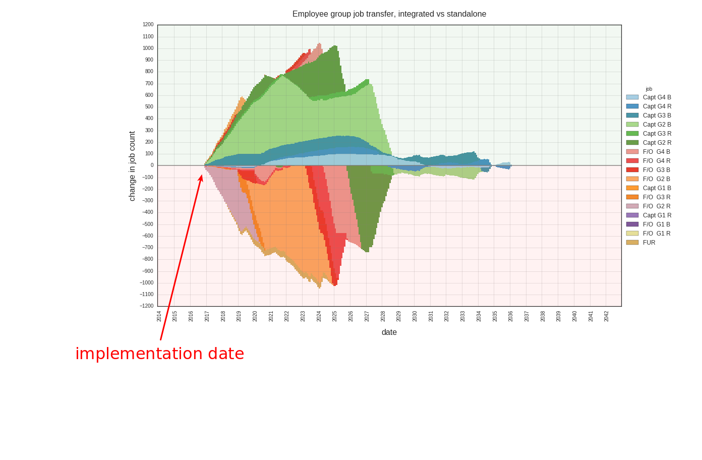
separate group job count changes over time, integrated vs. standalone, delayed implementation date, 16 job levels
Closely related to the above information is an analysis of the change in time spent in each position per employee. This scatter chart displays months in position differential between models. Each dot represents a change in the number of months spent in a job level for those employees who do in fact experience a change. There may be multiple dots positioned vertically for the same employee, but the monthly gains and losses for the same employee will always total zero. The differential is indicated with the y axis, and the x axis represents employee percentile position within an integrated list, most senior to the right.
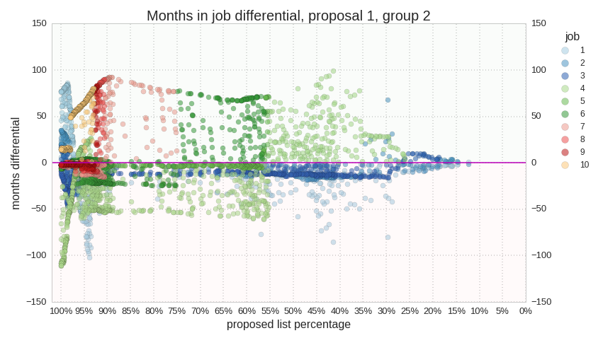
time in job differential for job levels 1 through 10, indicating more time spent in lower level jobs overall (job colors above the line are generally a lower rank than below the line)
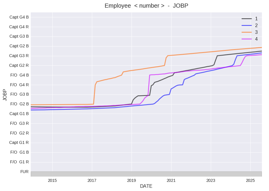
Comparisons between proposals for individual employees are simple to perform. This is an example of the same employee under standalone and three other proposed integrated lists. The different paths are affected by no bump, no flush, a pre-existing special condition, and other prospective conditions.
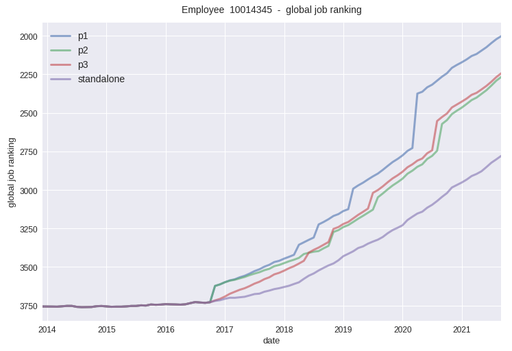
Here is another example, this time measuring the different outcomes for another employee with the cat_order, or global job rank attribute. The outcomes diverge at the modeled implementation date in late 2016.
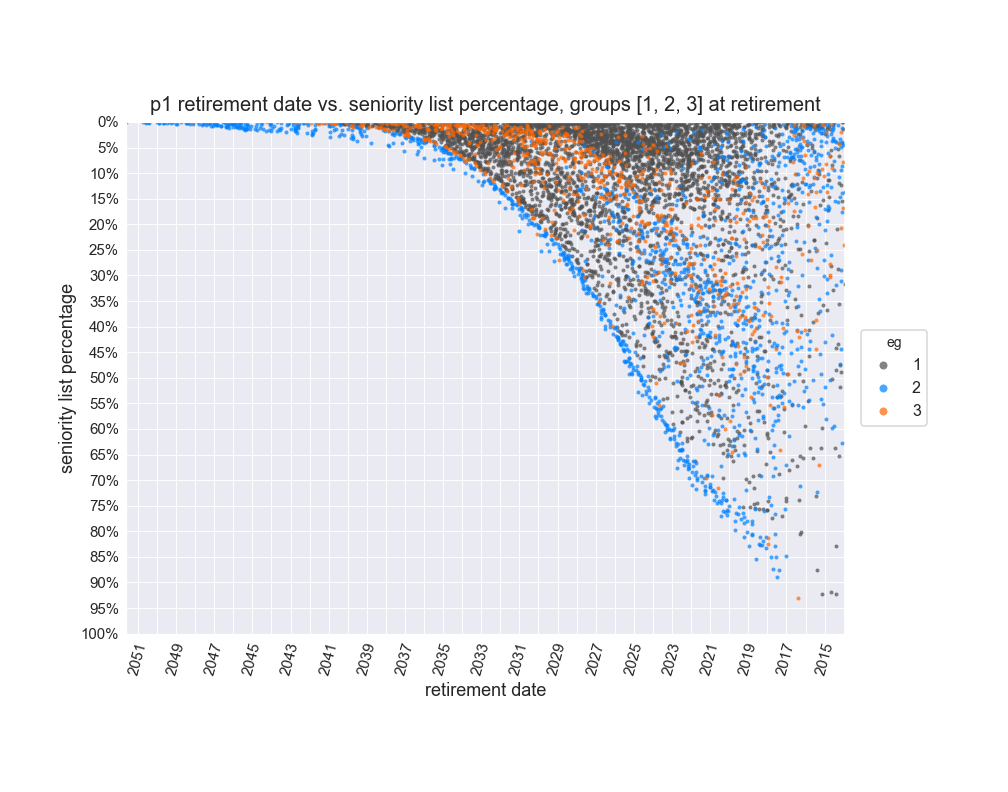
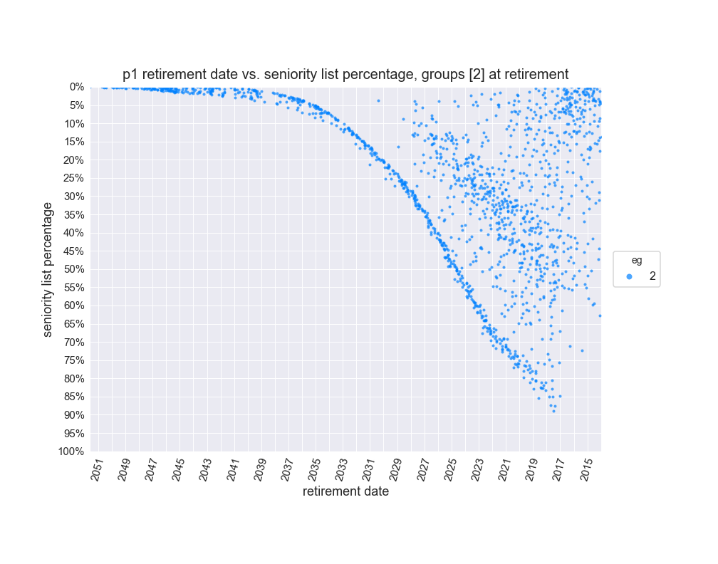
The next two charts indicate each employee’s percentage on the list at retirement and the month in which it will occur, for a given proposal or standalone.
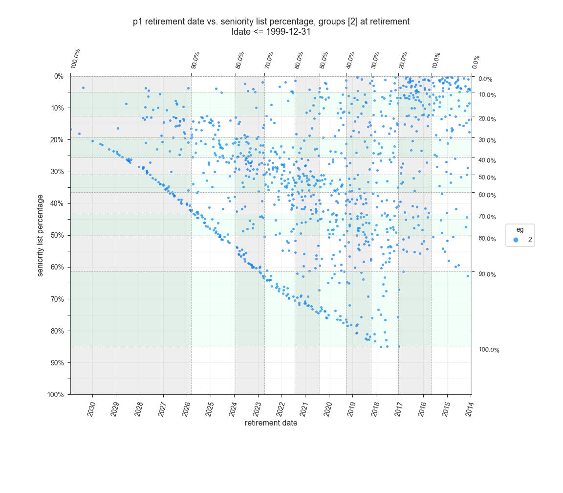
Quantile membership lines and bands may be used to compare population percentage with attribute levels. The chart below displays the list percentage at retirement for members of group 2 who have a longevity date of 1999 or earlier with the group 1 proposal. The addition of quantile bands reveals that 50% of that group (right chart scale) will retire within the top 31% of the proposed integreated seniority list (left chart scale).
Using the same conditions as above shows that group 1 fares much better, with 50% retiring within the top 5% of the proposed integrated seniority list. The quantile membership bands are available for any attribute comparison and may be set to correspond to the entire combined population or only to the displayed group(s).
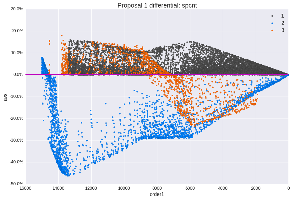
This is a scatter differential chart which can compare several attributes. In this example, seniority percentage at retirement vs. proposed list order is represented for three separate groups.
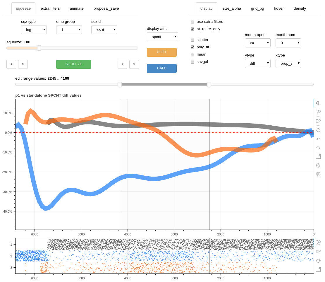
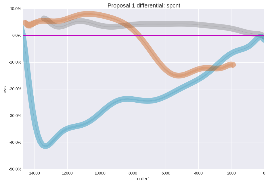
The same chart as above, with a polynomial fit applied. This helps to simplify the information and may be used with the editing tool.
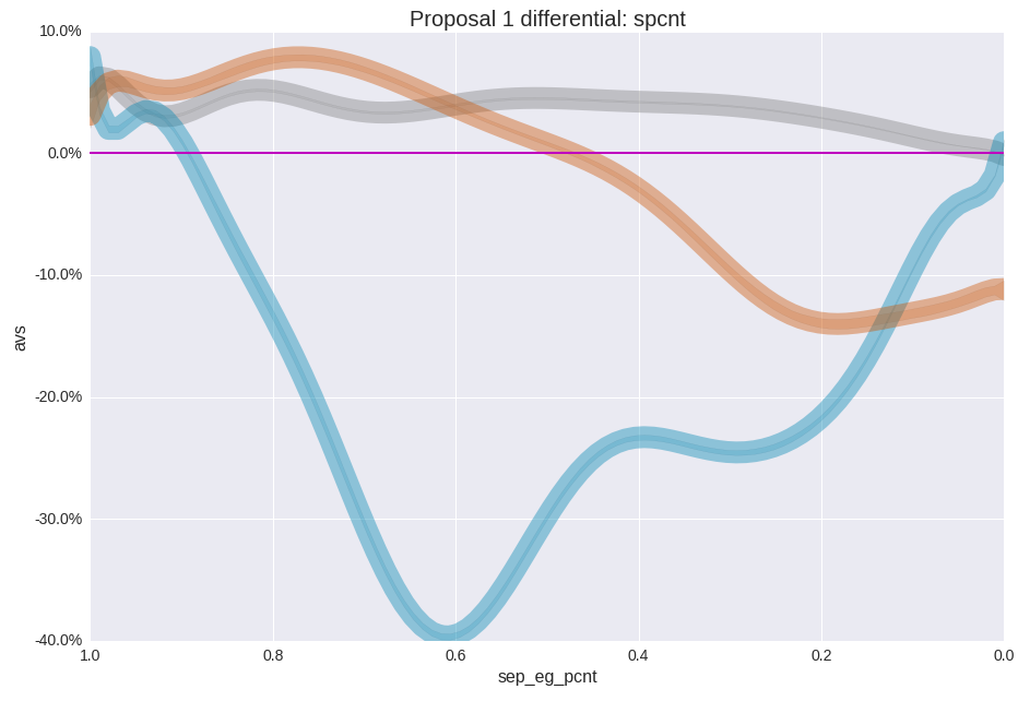
The two charts above had the x axis scaled to represent the proposal list order. The chart below organizes each group according to their native list percentage.
The next chart is related to the charts above. However, instead of showing results for each employee at retirement or monthly snapshop data, this chart indicates ranges of differential results over time. The bands of color within each plot represent the results for the same employee group under different list orderings and conditions. The chart below is showing data for group three under proposals one, two, and three.
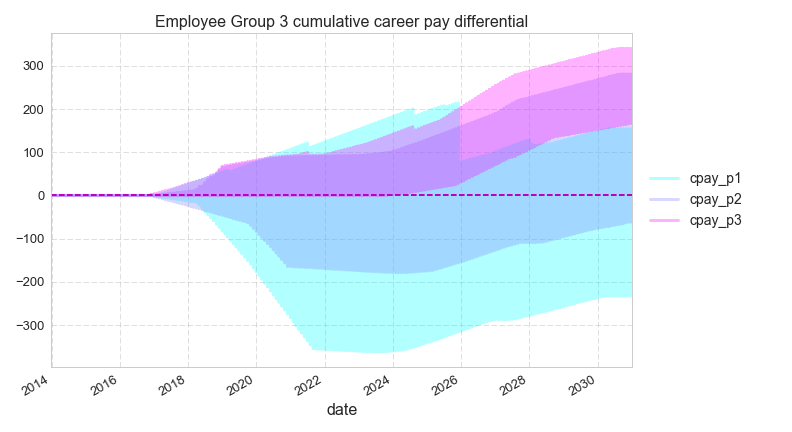
the colored bands represent different proposals, not different groups (a negative number indicates a change toward the top or senior levels of the list)
This type of study can look at other attributes and has an option to plot the mean of the data. Here is a job level differential chart. Note that as in the chart above, a negative number indicates an improvement to a higher level job (the best jobs have the lower job level numbers).
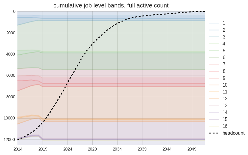
This is a time-series chart with job level bands and a headcount line. The headcount line indicates the extent of the remaining affected employees (present at the time of the merger) each year. The job level bands are responsive to the model fleet change inputs within the configuration file.
The next two charts show how seniority list percentage does not always equate to the same job bidding capability due to no bump, no flush and other conditions. The chart below includes three employees placed next to each other on an integrated proposal with an implementation date in late 2016. After that point, the three lines representing career progression as list percentage are superimposed.
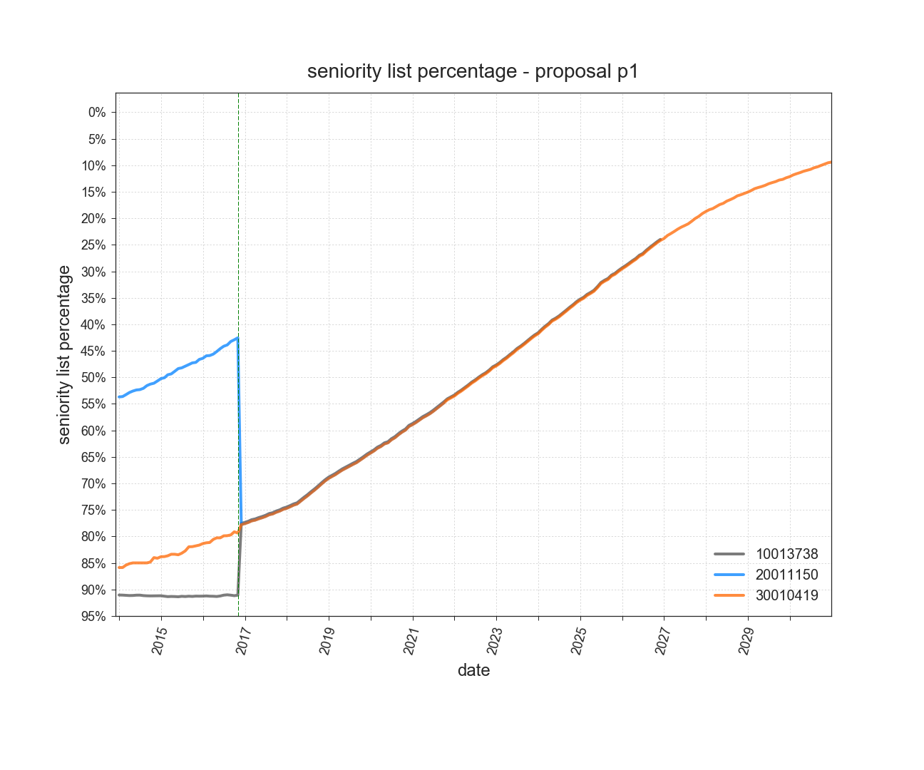
example career percentage, 3 separate group employees (superimposed, nearly identical percentage over time)
This chart reveals a more accurate model of what would occur in terms of jobs available to these three employees. The thin vertical dashed line represents a modeled implementation date. Each group operates independently until that time. The black line represents an employee with a pre-existing special condition, allowing the large jump in job levels. The blue line represents the employee who holds a higher ranked job at implementation which is protected until his retirement. Employees holding a job due to no bump, no flush protection or special job assignment rights remain in that job until his list partners from other group(s) “catch up”. Once the employees have reached the point in time where the same bidding opportunities exist for all three, they then move together in terms of list percentage, if they have not already retired.
The program model accurately accounts for all of these conditions.
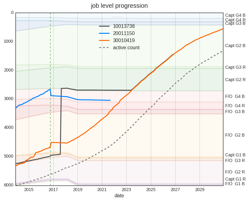
same employees and list as above, career progression through job levels with effects of special conditions and no bump no flush. y axis is arranged by job order number…
This type of chart may display selected groups of employees as well. This chart is showing projection for workers from one of the merging groups who have special job assignment quotas which pre-exist the merger. Each line represents the modeled career path for an individual worker.
a sampling of job progression plots belonging to a subset group with pre-existing job assignment quotas. Note the vertical lines representing a jump up to a level to satisfy a quota.
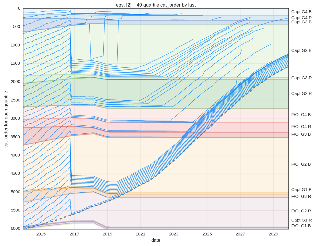
Another built-in chart type available with the seniority_list program is the quantile-groupby chart. Initial lists from each employee group may be segmented into equal-sized segments (quantiles) and the metrics associated with the employees belonging to those segments may be analyzed in various ways over time. This method provides information concerning the career progression experience of stratified sections of each employee group over many different metrics. The chart below is displaying the job category ranking results for an employee group split into 40 quantiles, or 2.5 percent bands, for a standalone (unmerged) employee group. The data shown here represents the results for the last employee within each quantile. Other methods, such as quantile average or median are also available for display.
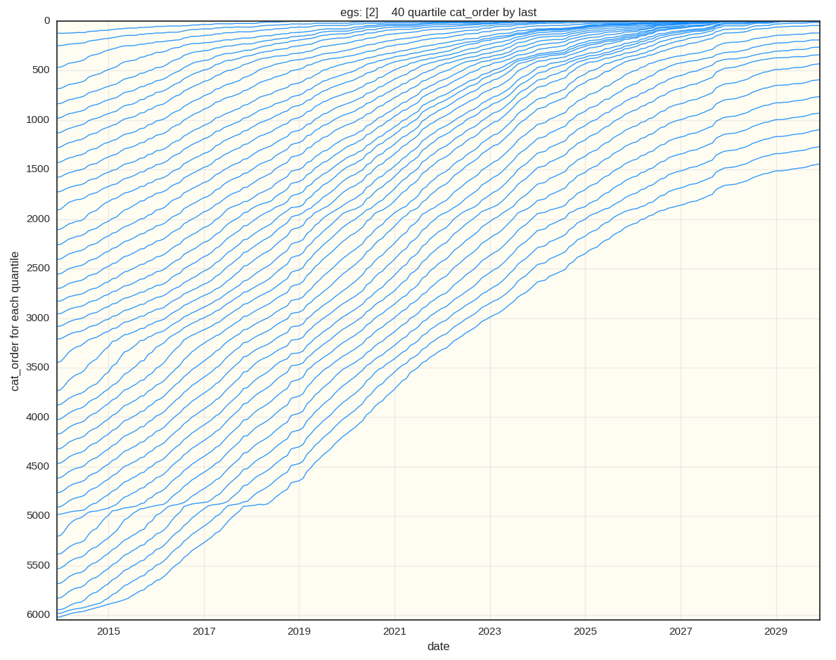
data representing the job category ranking of the last employee within each of 40 quantiles from the initial employee group population, standalone scenario.
Here are the results for the same employee group when combined with other employee groups using a proposed integration list and conditions. The results following the implementaion date in late 2016 indicate much lower job opportunities and long-term job level stagnation for this workgroup. This charting function is capable of measuring other data such as pay, list percentage, and jobs held over the life of the data model.
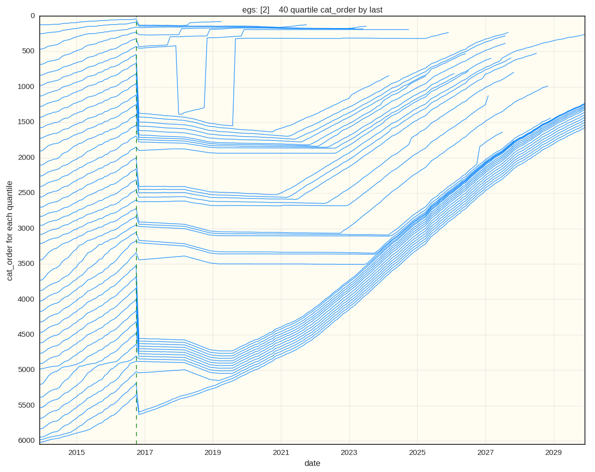
data representing the job category ranking of the last employee within each of 40 quantiles from the initial employee group population, integrated scenario.
When analyzing quantile groupings with the job category attribute, it is possible to show integrated job level zones in the chart background. Here is the same analysis as above with the addition of job bands.
The plot line colors may be pulled from a customized matplotlib colormap when plotting a single employee group, which adds further qualitative insight to this type of analysis. This example clearly reveals an employee group overwhelmingly disadvantaged with a proposed integration. While the employees are protected with “no-bump, no_flush” provisions (cannot normally be displaced from a job held at time of integration), due to poor placement within an integrated list, this group is relegated to the bottom sections of each of the job levels for quite some time with greatly diminished career advancement opportunities.
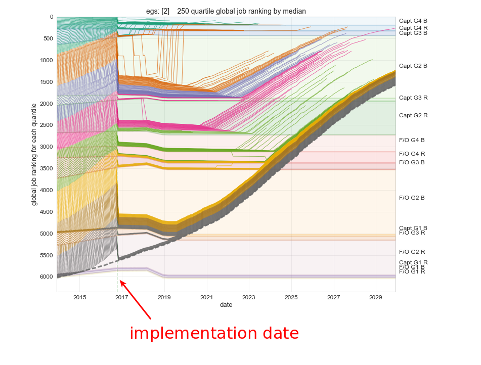
color spectrum line plots offer additional insight concerning the short- and long-term effects of proposed integrated list scenarios.
Quantile progression for the same employee group under different integrated list proposals may be directly compared by plotting the output from two different data models within the same chart. In the following example, the lines represent median job value ranking for employees grouped into 10 population quantiles. The progression lines diverge after the implementation date, with the solid lines representing standalone progression and the dashed lines representing the progression of the same quantile groups under a selected integration proposal. Clearly the selected proposal would cause major career stagnation and disruption for the employee group represented here.
dataset comparative line plots reveal differences in career progression for the same employee group under 2 different integrated list scenarios. The up and down trace for quantile group 2 is a result of applying a conditional job assignment rule with the integrated list proposal.
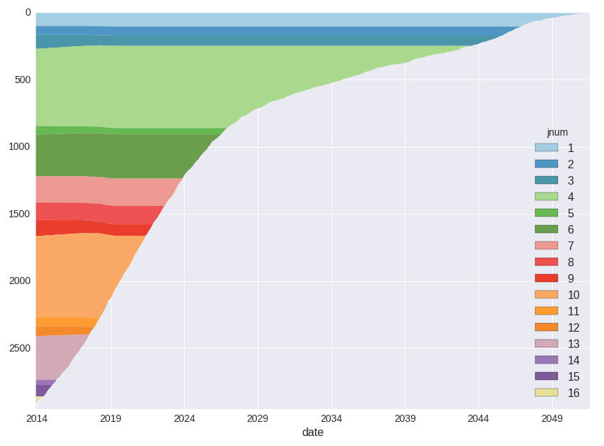
This chart represents separate group colored job (jnum) bands. The y axis represents the employee group count. The slight variations in job band thickness are due to modeled fleet changes. Employee career advancement tracks would all be contained within these bands, passing upward and to the right as employees age and become more senior.
Here are the job bands for the same separate group as in the above chart, as they are affected when a combined list proprosal is applied. The horizontal section at the left of the chart reflects a delayed implementation date.
This is a slightly different format of the same chart above with the addition of a sample career advancement track. In this scenario, the job bands “move up” almost at exactly the same pace as the example career track, meaning little to no job advancement for the sample employee for many years.
Here is an example of a separate group’s job bands under a proposal which allows more rapid advancement. (Notice the higher band levels reaching lower with time.)
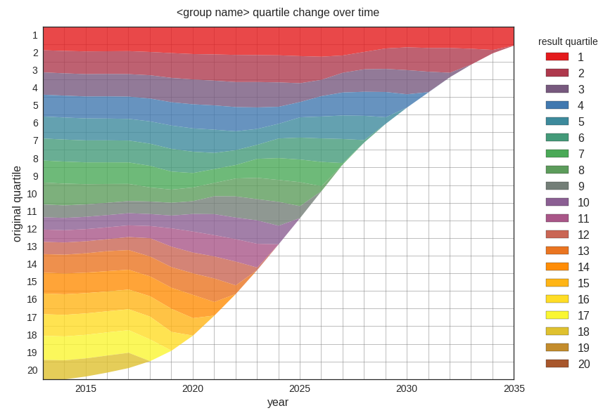
The following quantile change charts indicate relative position change only and do not directly represent potential job positions due to the effect of no bump, no flush considerations and other special conditions. These conditions are reflected in the “job band” type charts above. The quantile charts may also be diplayed as percentage band charts.
To use: compare the underlying quantile and year (square grid) with the resultant overlying colored grid level as indicated by the legend.
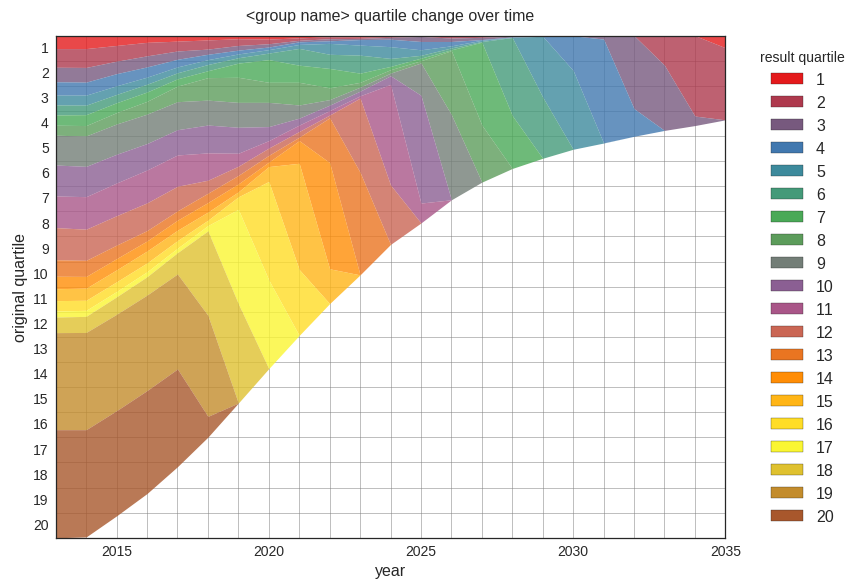
separate group post-integration quantile change over time indicating large distortion and loss for group
The slight change in the quantiles representation for a standalone group below is due to a modeled change in the number of jobs available to that standalone group over time.
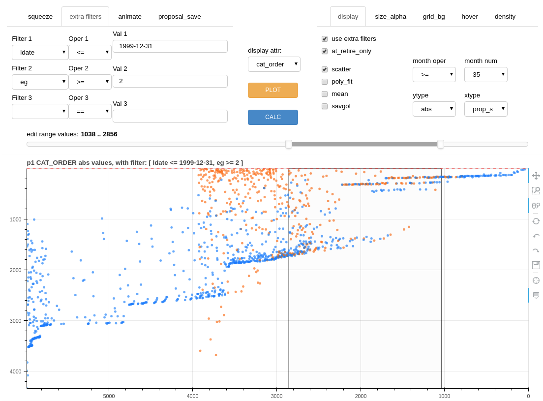
editor tool
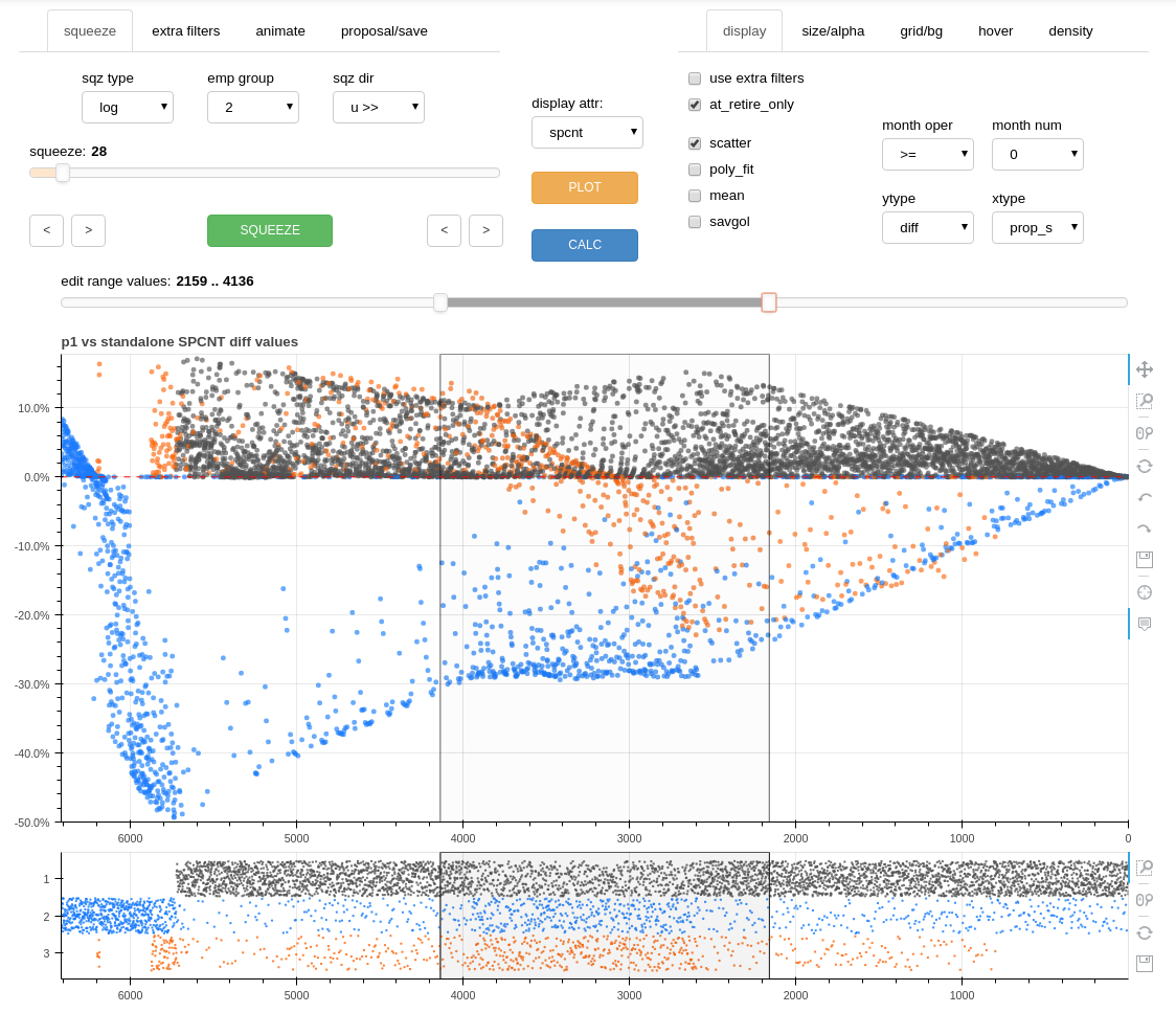
The editor is an interactive tool which allows list adjustments to be made and recalculated results to be viewed within seconds. The display includes a main display chart and a horizontal stripplot. The main chart may display a comparative attribute differential between two integration proposals or display absolute (actual) attribute values for a single integrated list proposal. Attributes such as list percentage, job levels, or career earnings values may be displayed for any or all employee groups upon reaching retirement or for any selected month. Comparisons may be made between proposals or with standalone data. The tool also includes a display filtering feature, allowing further analysis of targeted subgroups, such as employees with high longevity or within a specified job value range.
The editor tool was designed to easily identify outcome equity distortions associated with various proposals and to permit simple yet precise corrective editing. Distortions are identified through intuitive data visualization and corrections are made using the interactive editor controls and special program algorithms.
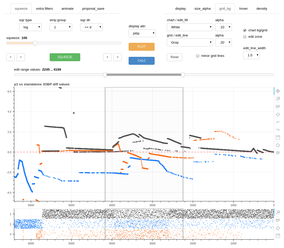
To make a corrective edit, the user positions two vertical cursors (lines) on either side of the target section using the “edit zone” range slider. Then after selecting the appropriate employee group, style of adjustment, and direction, a “squeeze” is performed which has the effect of sliding the target group up or down the proposed list (within the “edit zone”) while maintaining relative list order within each group. The results of the move are calculated and displayed for further analysis and adjustment if required. The stripplot offers a visualization of the density distribution of the groups within the proposed list order after the squeeze process but before the recalculation. All recalculations include all of the conditions in the overall model.
The following screenshot of the editor shows it in scatter mode and loaded with a list percentage at retirement differential chart described earlier.